WEBSTER BANKDigital consumer checking account application
I led the redesign of Webster Bank’s Consumer Checking digital application. I gave the application a visual refresh to maintain a consistent experience across our digital properties and designed new features to help users get through the application. I handed my designs off to engineers to implement and the application successfully went live on our public website, with tens of thousands of successfully submitted applications to date.
ROLELead designer
DURATIONOctober 2019 - July 2020
TEAMProduct owner, scrum master, 2 engineers, 3 front-end developers
CONTEXT
This project started as a joint initiative with the Digital Acquisition team, who wanted to gain stakeholder approval to redesign the consumer checking digital application. They wanted to come up with an example of “what could be” to show senior executives and make the case to start this project. We slowly started that work in 2019, not knowing that digital services would get pushed into the spotlight with the onset of COVID-19. The pandemic accelerated the demand to have a better service out there and also shed a light on the future of Webster’s entire digital storefront.
PROBLEM

GOAL
The business objective was to build an at-market end-to-end digital account opening experience for consumer deposit products that would increase conversion, digital originations, and value of the digitally acquired customer.
MY STRATEGY

RESEARCH
The developers started building the screens almost right away, so it’s not a surprise the engineers and architects were frustrated with the lack of documentation of which databases/stacks would be used for which customer actions. They originally asked me to incorporate all this additional information within the wireframes, but I knew there would be a better way to present this. The project couldn’t afford to pause to figure it out, so I quickly pivoted and tried to come up with a solution that would help everyone out. In my research, I came across service blueprints, and realized it was a great vessel to carry all this information and technical dependencies. I broke this journey down to its logical components such as points of customer contacts, service calls, supporting software, etc. This helped us align and prioritize on which areas of the service to focus time and resources on.

FEATURE PRIORITIZATION
To prioritize enhancements to our digital application, we considered what the “must-have” functionalities are that will solve our biggest challenges and meet customers’ basic expectation. Along with the business stakeholders and product owners, I identified what the basic features that a customer expects in any digital experience are vs. features that make an experience enjoyable vs. features that are surprise elements/unexpected.

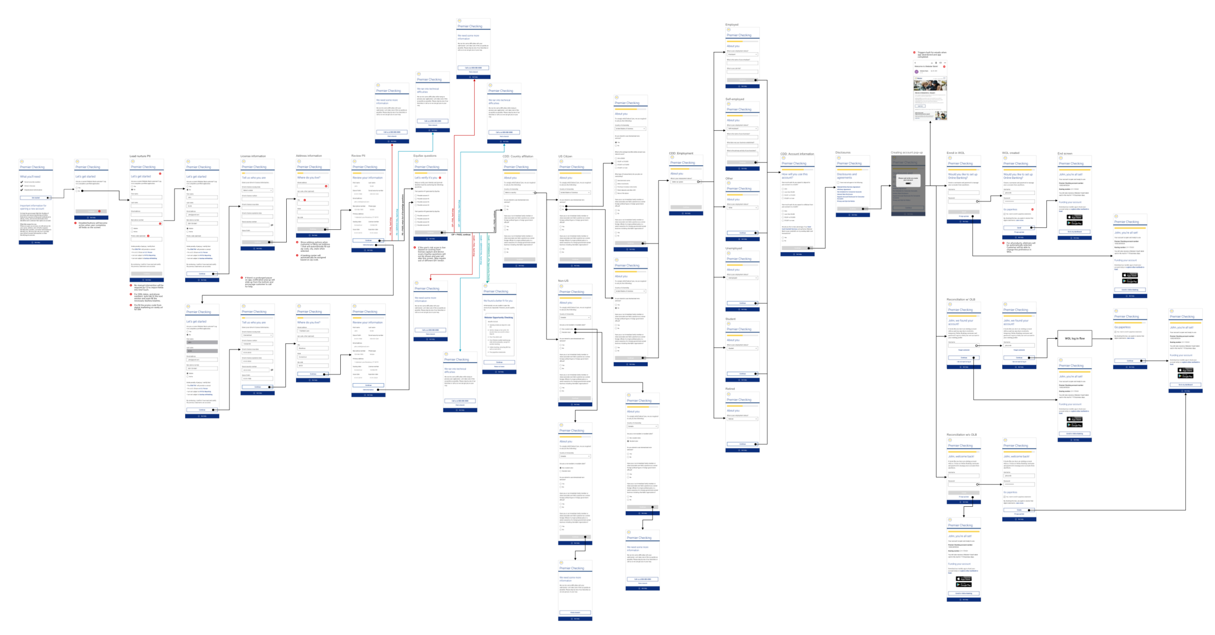
DESIGN
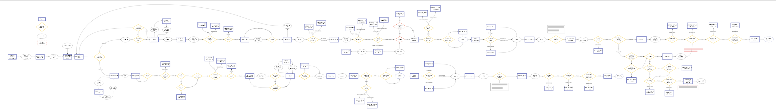
Once the developers started building the product, the PM and I realized there were so many edge cases to this seemingly simple experience. Even with the limited MVP scope, there were too many dependencies and so once again, the team came to me asking if I could come up with something that would illustrate all the dependencies and backend logic that would affect a customer’s journey through the application. I worked with the solutions architect to create a customer experience version of their sequence diagrams. I charted how a customer progresses through all the screens of the app to submission, and any edge cases that arise. We also documented what the conditionals were that directed the experience. This also served as the QA team’s main source of truth to reference when going through their testing.
TESTING
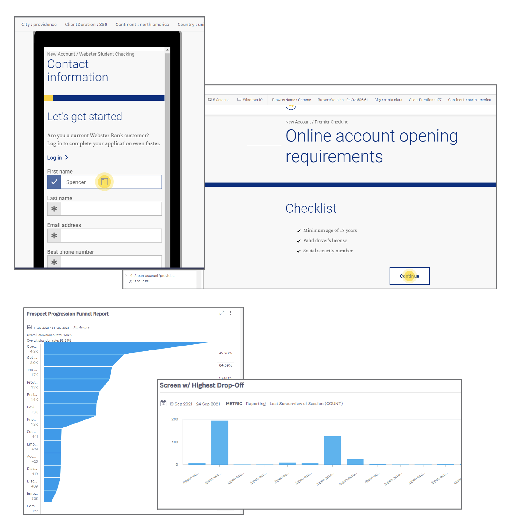
From the beginning, one of the biggest concerns was the 2% completion rate – my biggest concern was that we had no idea why. We had the numbers from Google Analytics page views, but no behavioral insight. Acoustic Tealeaf allows us to watch customer experiences, identify struggle moments and develop improvements based on real behavior. By using this tool, we have a continuous feedback loop driving enhancements to our digital experience. Since we launched the digital application, we’ve also had 10 Tealeaf releases and have been able to identify 25+ additional enhancements. These have resulted in everything from minor UI component fixes to screen-wide information hierarchy improvements.
OUTCOME


TAKEAWAYS
Early results show the benefits of the improved customer experience, however with significant fraud volumes. We also found that new customer highly value the local banker outreach. Future plans include goals to reduce fraud and improve the value of digitally acquired accounts.