WEBSTER BANKServicing digital loan applications
I led the design of the Small Business Lending (SBL) online application from researching, identifying problems, to designing and handing off for implementation. The application has already rolled out to dozens of bankers, impacting a total of 1000+ internal and external users.
ROLELead Designer
DURATIONFebruary - September 2022
TEAMProduct owner, 2 engineers, 2 front-end developers
CONTEXT
Our prior SBL digital application was launched in 2019 with the help of an external agency. This application was repurposed and recycled at the onset of the COVID-19 pandemic to serve as the Paycheck Protection Program (PPP) loan application. As PPP Forgiveness rolled out and the business need for the prior digital application skyrocketed, I was pulled into a project to bring back an SBL digital application. Unfortunately, there was no way to resurface the old application, and so we had to start from scratch.
PROBLEM
Despite feedback from internal stakeholders that the prior SBL digital application was “fine”, I could see from the conversion funnel that there was room for improvement — I just had to find it. From the numbers I pulled from Google Analytics, only 55% of those who started our application submitted it, and only 8% of those submissions made it to the funding stage. In addition, very few traditional banks offer a digital application for small business loans as only 3 of our 11 competitive financial institutions I looked at in my competitive market research had one: Citizens Bank, Wells Fargo, and TD Bank.
GOAL
Make the online application as intuitive and comprehensive as possible to meet the various small business owner needs, while increasing application submission and origination rates.
MY STRATEGY
FINAL SOLUTION
The SBL digital application was launched to internal bankers and on the public website for customers to access it. It now has a more elevated feel, consistent with the rest of our digital storefront, along with a more intuitive application process. Due to the discoveries I made during this project, there has now been a separate project initiated to investigate opportunities to automate the back-office manual actions our internal colleagues do.
RESEARCH
My focus was to document the frustrations to understand why they were happening. I held more than a dozen discovery sessions with the various loan teams and thoroughly investigated their points of contact; this in-depth discovery was crucial so I could document what was known and what gaps in understanding I still needed to get answers to. Bankers relayed their observations from helping customers and any frequent frustrations they encountered. The loan intake team was crucial in helping me understand what affected the timeline and what they need to be able to process these loans faster. The BSA team helped clarify the implications of the fields, which uncovered opportunities to simplify the application.
One of the biggest discoveries during this phase was how many steps there were in the back office to get a loan to the funding stage. The business and product teams used this to align and prioritize which areas of the service to focus project time and resources on; weeks of prioritization sessions led to our MVP scope and future phases.
RESEARCH TAKEAWAYS
COLLABORATING WITH STAKEHOLDERS
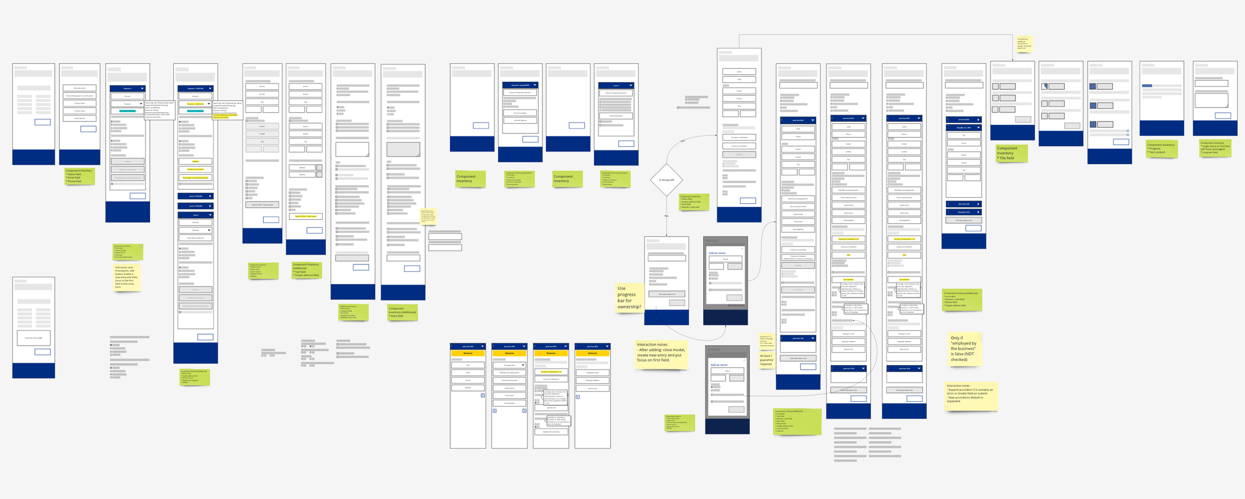
I worked with various teams to establish the visual design. I designed in mobile-first to prioritize the core of the UX and functionality, and most of the components were reused from the design system we created during a previous project. The product owner used the user story map I created to create Jira epics/stories and coupled with these wireframes, they functioned as the design requirements for the project.
TESTING
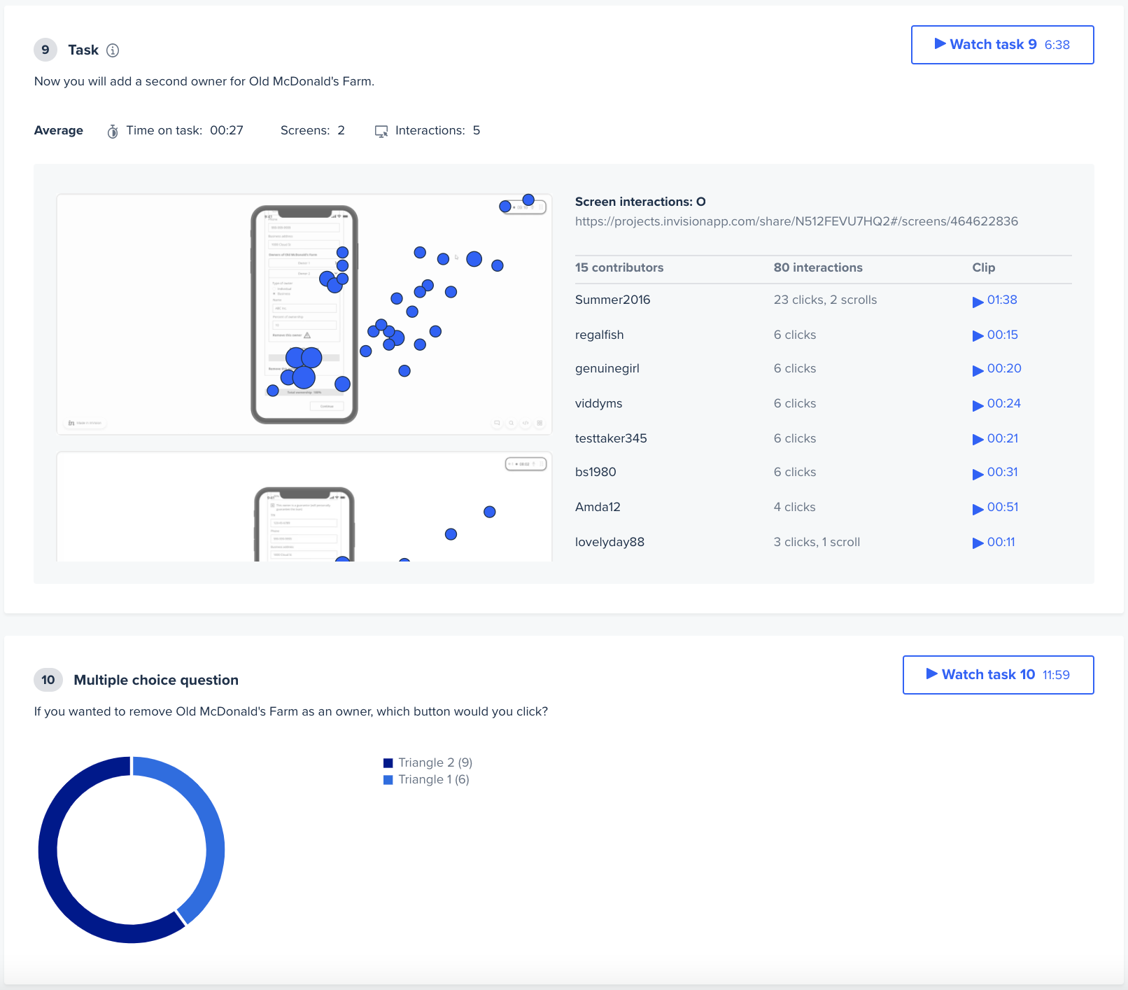
I quickly realized that with insufficient market research and rushed timelines, I needed to make decisions quickly and find another source of validation. I leveraged UserTesting to provide actionable feedback in a short period of time. The business stakeholders also loved it — it was their first time experiencing rapid turnaround of feedback! Throughout the sprints, I was able to check my decisions and assumptions by setting up UserTesting sessions. For example, to help inform how I should breakout the multitude of fields that the business stakeholders needed, I did an A/B test on the Owners screens; Test A had both direct and indirect owners on the same screen while Test B had them on separate screens. By asking participants questions like, “Which CTA would you use to remove a direct vs. indirect owner?” I found that having both types of owners on the same screen led to a lot of mistakes and general confusion. This, coupled with the business knowledge that the frequency of having indirect owners was fairly low, I felt confident in the decision to separate them out.
DESIGN HANDOFF
I created handoff documents to my engineers providing details for every screen that requires context and organized them into flows to streamline their understanding. I also worked closely with them to make sure they understand the details throughout the process.
OUTCOMES
TAKEAWAYS
Our team realized the real problem, which deviated from the initial problem given, and gathered all our insights and convinced the Line of Business to pivot direction and prioritize automating the back-office manual processes. Because of our efforts, we were able to better advocate for our internal stakeholders and work towards a solution that truly caters to their needs and ultimately addressed the core pain points of the loan application process.


